Watches - another OCD problem
-
So many things I hate about that Omega, including the Bond association (I dislike movie-themed watches), Titanium case, fake aged tritium, He release, a novel written on the dial…. but I really like it.
-
@Anesthetist I like the Broadsword a lot, and certainly more than the Hublot you passed on!
The Bond watch is interesting. I like the fact that it's no date, has a titanium case, and the mesh bracelet looks good. I'm not so sure about the solid case back and broad arrow on the dial.
The bezel is aluminium, so that it'll fade. I quite like the idea, though I'd have probably preferred ceramic and no faux patina lume.
-
I don't really mind the broad arrow, though I think it would be better without it. I actually like the solid case back, as it makes the watch a bit thinner, and I've become indifferent to display backs in general. I love the mesh; I think that looks fantastic. The one thing that I really don't like about the watch overall is the fake aged lume and "faded" dial. All that said, I think this is the best looking Bond watch Omega has done, in part because there aren't any obvious and tacky movie tie-ins.
-
. All that said, I think this is the best looking Bond watch Omega has done, in part because there aren't any obvious and tacky movie tie-ins.
That must be it. No barrel rifling on the dial or 007 logos.
Exhibition casebacks on the very plain industrial movements Omega cases for watched like this make no sense to me. Especially on a diving watch.
-
Exhibition caseback on a diving watch is sheer stupidity IMO. Which, apart from the date window being in the "wrong" place, is why this was on no interest to me when hunting down a Fifty Fathoms….
https://monochrome-watches.com/the-blancpain-fifty-fathoms-automatique-5015-now-in-titanium/
or this...
https://monochrome-watches.com/unique-blancpain-fifty-fathoms-barakuda-for-only-watch-2019-hands-on/
-
I wouldn't take this watch over my older generation SMPc's with lacquer dials, but it has a couple things I like over the new models
1. Broad Arrow is cool
2. No date is cool (though less useful)
3. No waves on the dial. I've seen the new SMPc in person a few times, and the waves on the dial remind me of an air conditioning vent.
4. Solid caseback (it's cool to look at the movement for the first week, then I've lost interest)I have one or two watches with fauxtina, and it doesn't bother me at all. It actually brings the watch strap together with the dial for me. I usually wear a black strap or an earth toned strap, so having brown in the dial works for me.
-
Exhibition caseback on a diving watch is sheer stupidity IMO. Which, apart from the date window being in the "wrong" place, is why this was on no interest to me when hunting down a Fifty Fathoms….
Date windows at 4:30 are a crime against humanity. The best spot is either at 12 or 6. 3 is acceptable, just because of tradition.
-
I don't know how I feel about the date at 12, but I've found that 3 is desirable if you need the date with any level of frequency, 6 is out of the way and helps with symmetry but my eye is not immediately drawn there.
I would rather not have the date altogether than have it at 430.
I hate the date at 430 as much as most people hate the He escape valve.
-
You get used to the window at 6 pretty quickly. I actually had a watch modified to add a date window at 6 to a no date model.
As for the date at 12, I think it might only work with an oversized date like A. Lange & Söhne does. -
I'll have to disagree about 4:30 being a bad place for the date on a diver in all cases, for two reasons: first, if done correctly, it becomes inconspicuous and fades into the background until you are looking for it (the FF does this well, but the FF Bathyscaphe does not), and second, particularly on divers, it minimizes the disruption of the lume pattern. One easy way to mitigate this is to place the date at 3 (or 6… I guess...) on a lumed disc or ring that matches the color of the other indices (though I'm not sure whether this is ever done). Some have tackled this by having an abbreviated index at 3 to make room for the date window. And in the end, if you're simply missing an index at 3 (or less desirably at 6) in lieu of a date window, you can still read the asymmetric lume.
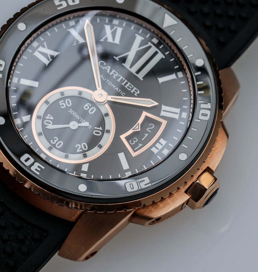
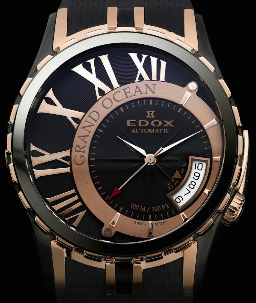
The biggest crime in date windows aside from misalignment is apertures that show dates before and after the indexed date. That looks like shit and needlessly complicates the read. Does the wearer not know what dates come before or after a given date ("Shit, what day was yesterday? I better check my watch. I see that today is the 9th. Ah, there it is. The 8th. Yesterday was the 8th.") To wit:

or even more hideously,

Also, for whatever reason I really dislike showing the day of the week unless the watch is an annual or perpetual calendar. I guess I'm a fan of sneaking the date in there, if at all.
-
Watch shopping in St Thomas was mind numbingly awesome. Pretty much every major house was represented within a 3 block radius. I finally got to try on the Bulgari Octo ultrathin and even with the price tag it was hard to take off.


Sent from my iPhone using Tapatalk
-
I'll have to avoid St Thomas @Anesthetist . It could prove an expensive destination!
The Octo Finissimo is rather good. I particularly like the black ceramic version.
As for date windows, I think that the Glasshütte SeaQ does it best on a divers watch.

-
I like that. Completely unobtrusive but it’s there when you need it.
Sent from my iPhone using Tapatalk
-
Counterpoint: if they didn't render numerals at various angles on tachymeter scales they would look pretty bad.
Love this Blancpain dress watch

-
That Blancpain is perfection
Sent from my iPhone using Tapatalk


