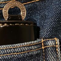
The Red W
-
@joephoto - absolutely agree. red w is great. i dont like the tags so much especially on the uhf's. i would like to have red W on every shirt
-
@endo
awesome
think I need the W on my 805 too
-
I liken the red W to other famous brand logos in that it’s subtle but instantly recognizable to those in the know.
I truly hope IH keeps using this, especially on their denim. It’s a small detail, but a very important one IMHO. These small details are one of the things that sets the brand apart, and makes it exclusive feeling (to me anyway).
-
It's quite a big change for IH, one that will divide opinion. Personally I remove all visible branding where possible, certainly on my shirts and tops. I like a 'stealth wealth' look, quality that doesn't shout. At the very least I'd advocate for different coloured logos to suit the shirt in question, for a slightly more subtle effect, as seen on some of the shirts upthread.
-
Having said that, I've always found it cool that the brand suits a wide range of styles, personalities, degrees of taste in blingitude etc etc. And that it draws on the history of 20th century workwear without being slavish or purist about 'heritage'. IH really is a lot of things to a lot of people, and ultimately as Alex says it's Haraki's show. The above post just my 2 cents.
-
I remember in the 80’s when Edwin jeans were all the rage. And if you remember them you probably knew they were Edwin because of…? The tag.
-
Catching up on this thread... personally, I like the red W on jeans (Haraki’s homage to Levi’s right?). I don’t like it on the shirts unless it’s solo on a tee. I prefer the IH tag because it’s more in line with workwear and easier to remove if you choose. I don’t care for the double branding because I think it looks too cluttered. And I can’t tell you how hard it is for me to say anything even resembling a negative about IH

-
I would prefer a Tuesday….


